
18th December 2015 by aegeuana_sjp_admin
Google's new page ranking algorithm
If having a mobile-friendly website was important before, well then now it’s more important than ever. Google has announced a new algorithm they intend to put into effect by the 21st of April – in a little less than a week. The announcement came on the 21st of February, giving developers only a couple of months to adapt their websites or risk falling down the rankings.
The new algorithm focuses on rearranging mobile search result rankings to give prominence to relevant websites that are mobile-friendly, over other relevant websites that are not. This comes in the wake of data that shows that a whopping 60% of Google’s traffic is via mobile devices – a statistic that has been steadily increasing since the emergence of smartphones and tablets, and it doesn’t look like slowing down anytime soon. As a result, Google is adapting and changing with the times.
To make your website more mobile-friendly, it’s worth taking the time out to have a look through Google’s very own guide to mobile-friendly sites. Or if you just want to see how well your website fares, the guide also comes with a handy mobile-friendly website test.
The criteria
Preparing a website for mobile devices takes a lot of time and consideration. It is worth planning, designing and building your website with mobile in mind from the very beginning, rather than trying to force a square peg in a round hole later on. That being said, here are the main points and changes to focus on to make your website ready for Google’s new algorithm.
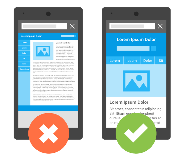
Google is a strong advocate of responsive web design, and is making this the key focal point of their new algorithm update. This means having one website that will work across all devices and no more duplicate content. A link to a specific page should work on both devices and not point to somewhere different for mobile or desktop. Long gone are the days of making two different websites: one for mobile and one for desktop. Not only is RWD a cheaper solution, but it saves time building and maintaining. Put simply, it’s just better practice.

A lot of people argue that having a separate mobile website is better for the end user. Primarily, because we still live in a time where mobile network operators still charge and arm and a leg for data usage, as well as having poor network performance (download speeds) in certain areas (usually rural). The idea here is that the mobile specific site is lightweight and stripped of unnecessary content for the benefit of the end user.
While this is an extremely considerate approach, I’m not sure how much it really benefits the user anymore. Having a watered down version usually means it ruins the user experience. Network coverage and speeds are improving and are only going to get better. In addition to this, we are seeing more operators providing unlimited data plans at competitive prices, which means worrying about data usage is quickly becoming a thing of the past.
The answer is definitely responsive web design. It is good to be concerned about performance and data usage, but the solution shouldn’t be to compromise the mobile users experience, but instead to change our way of designing websites and to optimize them as much as possible for everyone’s benefit.
References:
http://googlewebmastercentral.blogspot.co.uk/2015/02/finding-more-mobile-friendly-search.html
http://designmodo.com/mobile-friendly-algorithm/


